ShopDreamUp AI ArtDreamUp
Deviation Actions
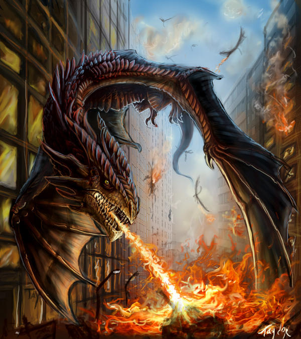
![[OPEN] - Dragon- (91)](https://images-wixmp-ed30a86b8c4ca887773594c2.wixmp.com/f/85402926-1786-47c5-aa82-d6f2e29275dd/dgolyjb-e188429a-e724-45e7-a66e-60088765faf8.jpg/v1/fill/w_311,h_400,q_70,strp/_open____dragon___91__by_dnataoai_dgolyjb-400t.jpg?token=eyJ0eXAiOiJKV1QiLCJhbGciOiJIUzI1NiJ9.eyJzdWIiOiJ1cm46YXBwOjdlMGQxODg5ODIyNjQzNzNhNWYwZDQxNWVhMGQyNmUwIiwiaXNzIjoidXJuOmFwcDo3ZTBkMTg4OTgyMjY0MzczYTVmMGQ0MTVlYTBkMjZlMCIsIm9iaiI6W1t7InBhdGgiOiJcL2ZcLzg1NDAyOTI2LTE3ODYtNDdjNS1hYTgyLWQ2ZjJlMjkyNzVkZFwvZGdvbHlqYi1lMTg4NDI5YS1lNzI0LTQ1ZTctYTY2ZS02MDA4ODc2NWZhZjguanBnIiwiaGVpZ2h0IjoiPD0xMDI5Iiwid2lkdGgiOiI8PTgwMCJ9XV0sImF1ZCI6WyJ1cm46c2VydmljZTppbWFnZS53YXRlcm1hcmsiXSwid21rIjp7InBhdGgiOiJcL3dtXC84NTQwMjkyNi0xNzg2LTQ3YzUtYWE4Mi1kNmYyZTI5Mjc1ZGRcL2RuYXRhb2FpLTQucG5nIiwib3BhY2l0eSI6OTUsInByb3BvcnRpb25zIjowLjQ1LCJncmF2aXR5IjoiY2VudGVyIn19.8RQ6NhwqEaR9hBHDHQxeRMwlQn8R_yohgEh2k8mSojA)


Description
This is done or now. I listen to all the critics and I tried to make it look better. And I think it does. I'm really happy with the result. I could work a bit more on the details though. I'll maybe edit work on it again when i have more time.
The red dragons have return after a few hundred years. Humans don't want to live in harmony with the dragons as they used too. A battle starts.
15 hours work in Photoshop
The red dragons have return after a few hundred years. Humans don't want to live in harmony with the dragons as they used too. A battle starts.
15 hours work in Photoshop
Image size
800x900px 310.61 KB
© 2009 - 2024 Ruth-Tay
Comments69
Join the community to add your comment. Already a deviant? Log In
That looks pretty cool! First of all, I really don't think the dragon would be able to keep airborne in that narrow street with that big of a wingspan, as he would hit the buildings and basically crash.
And you should take a look at the perspective too, the buildings on the right, doesn't seem to match up with the buildings on the left (mainly the windows) or vice versa. The hight on the windows don't match up on the closest building on the left.
But you got a good sense of depth and well done on the flames! But I think you should remove the black lines around the teeth.
But keep at it, great detail and very good work on the scales.